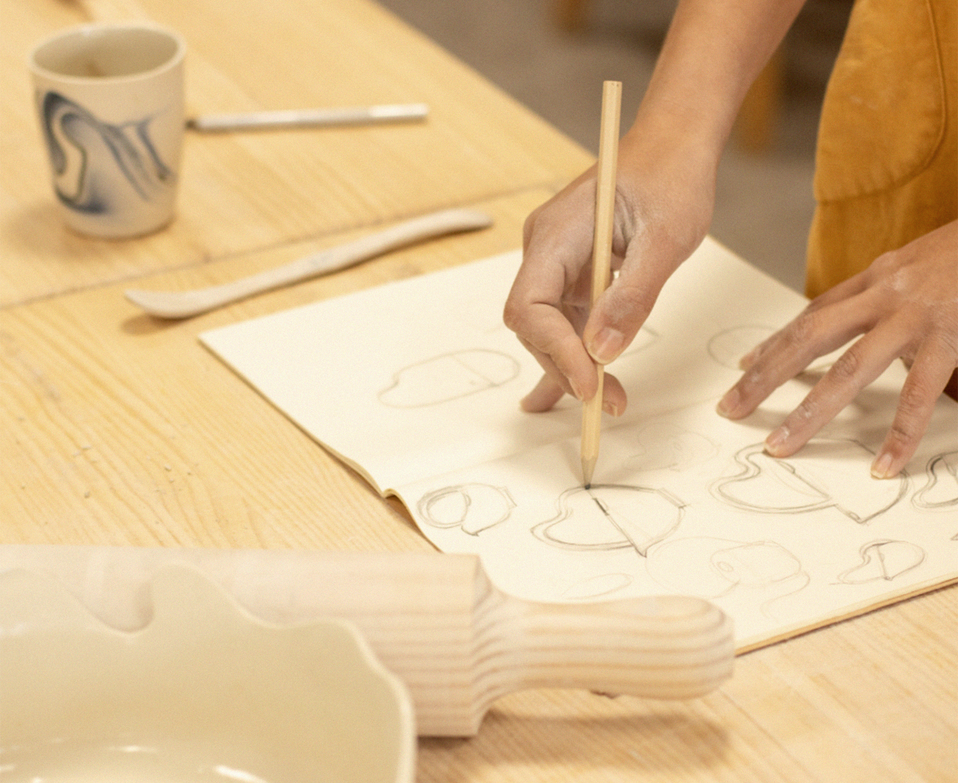
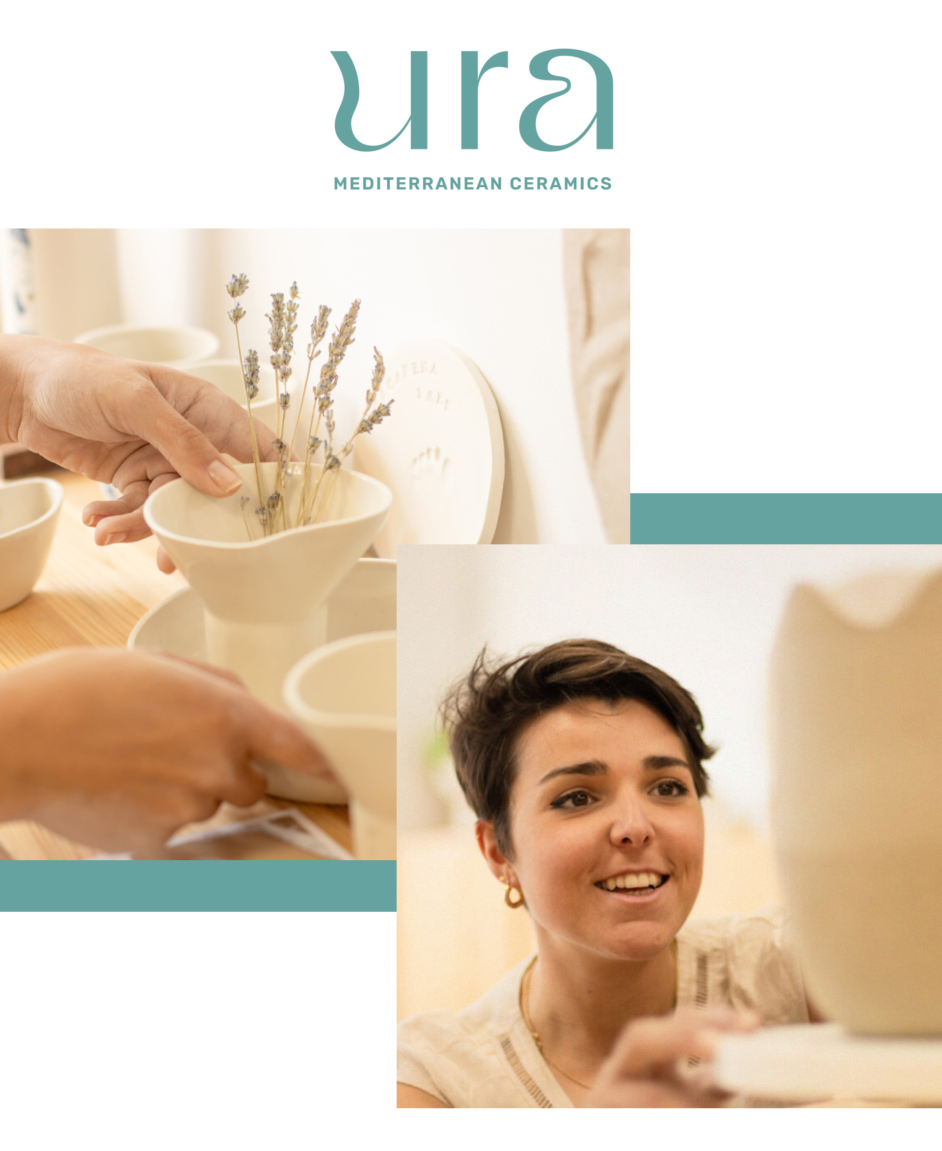
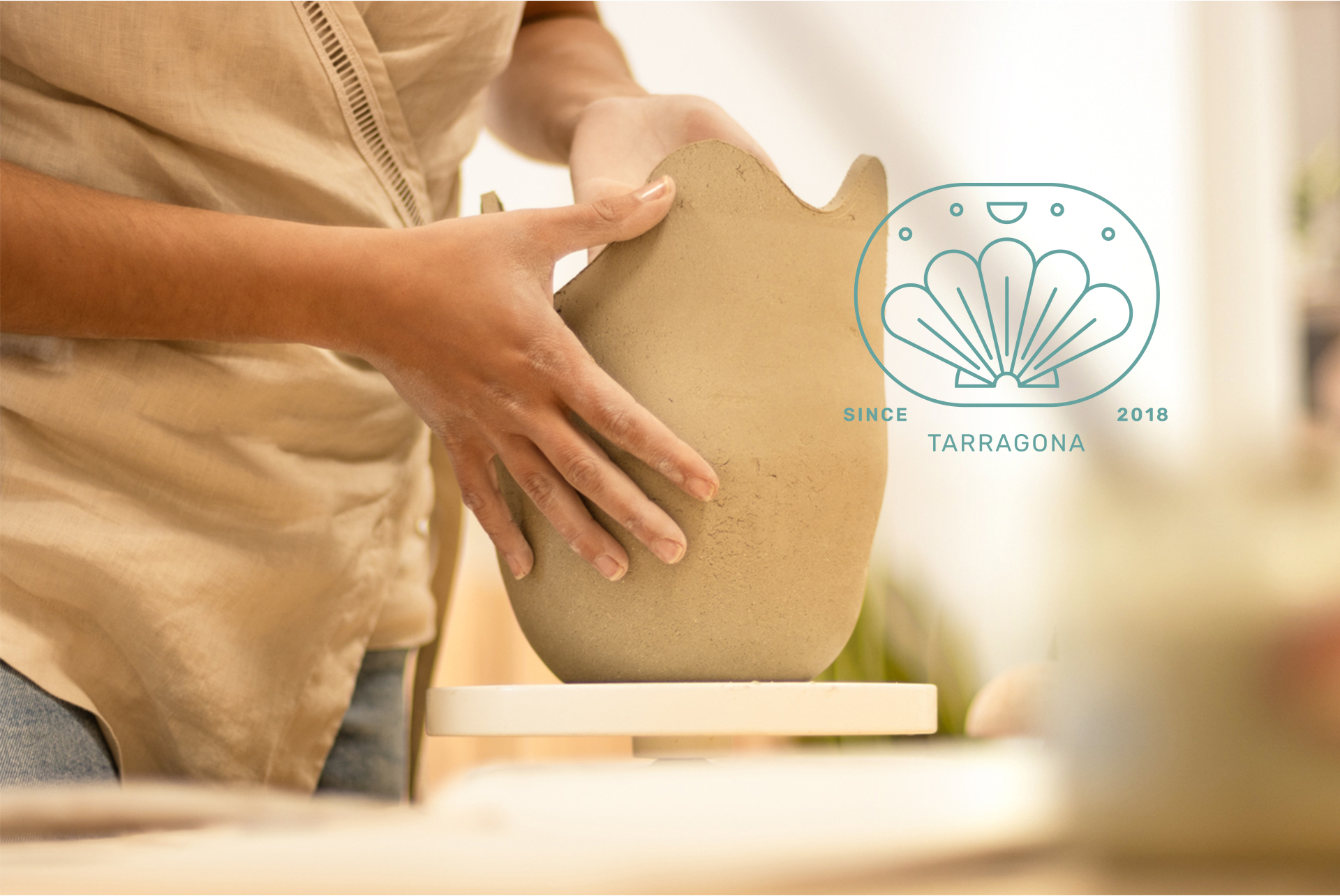
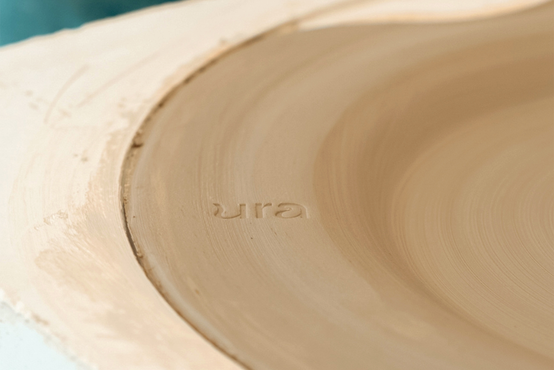
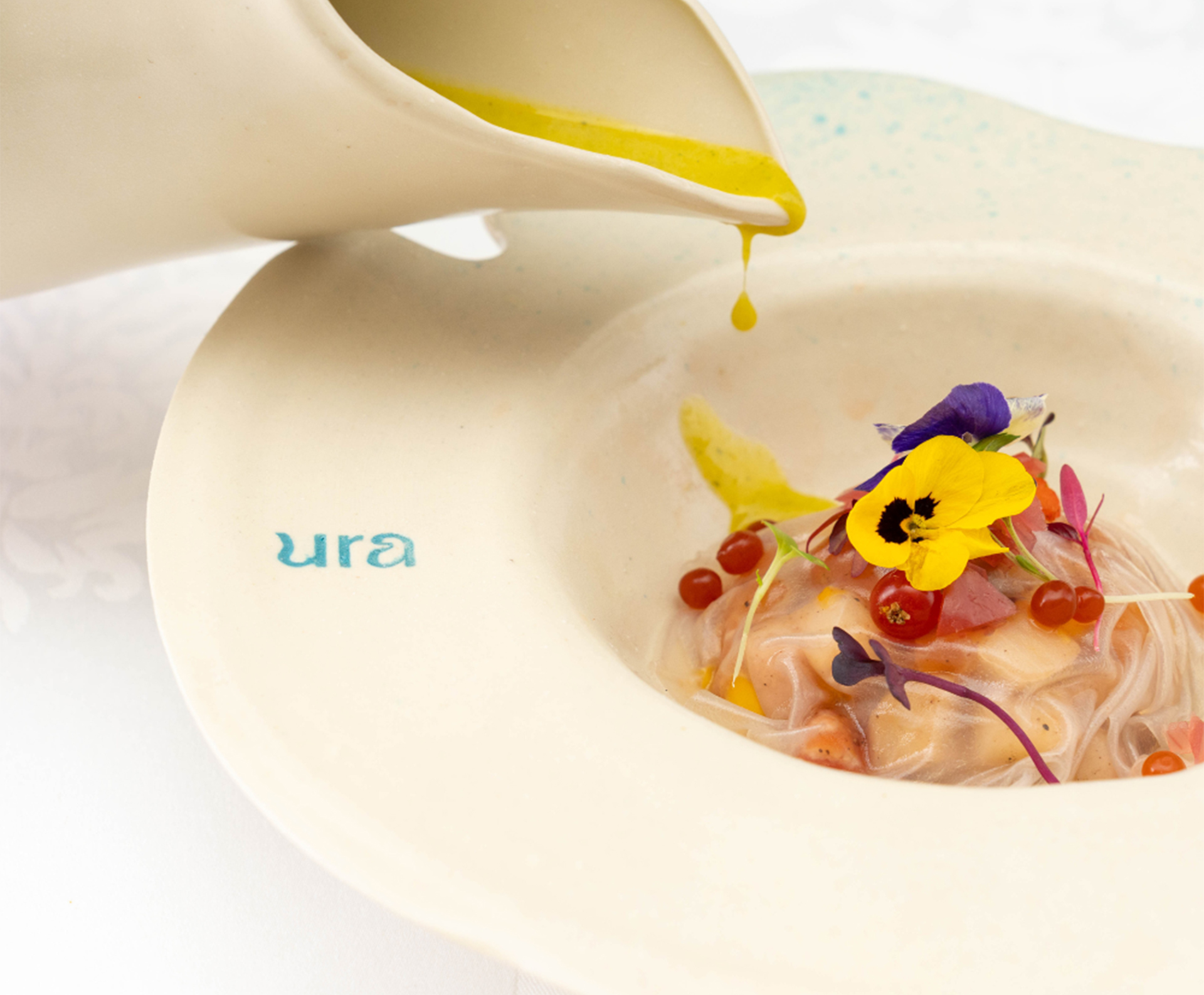
Corporate Identity Design for Laura Checa (URA), professional ceramicist. Laura wanted to update her outdated visual identity. After a preliminary analysis, we developed a value proposition, delving into her needs and how her brand should communicate visually in order to stand out from the competition.
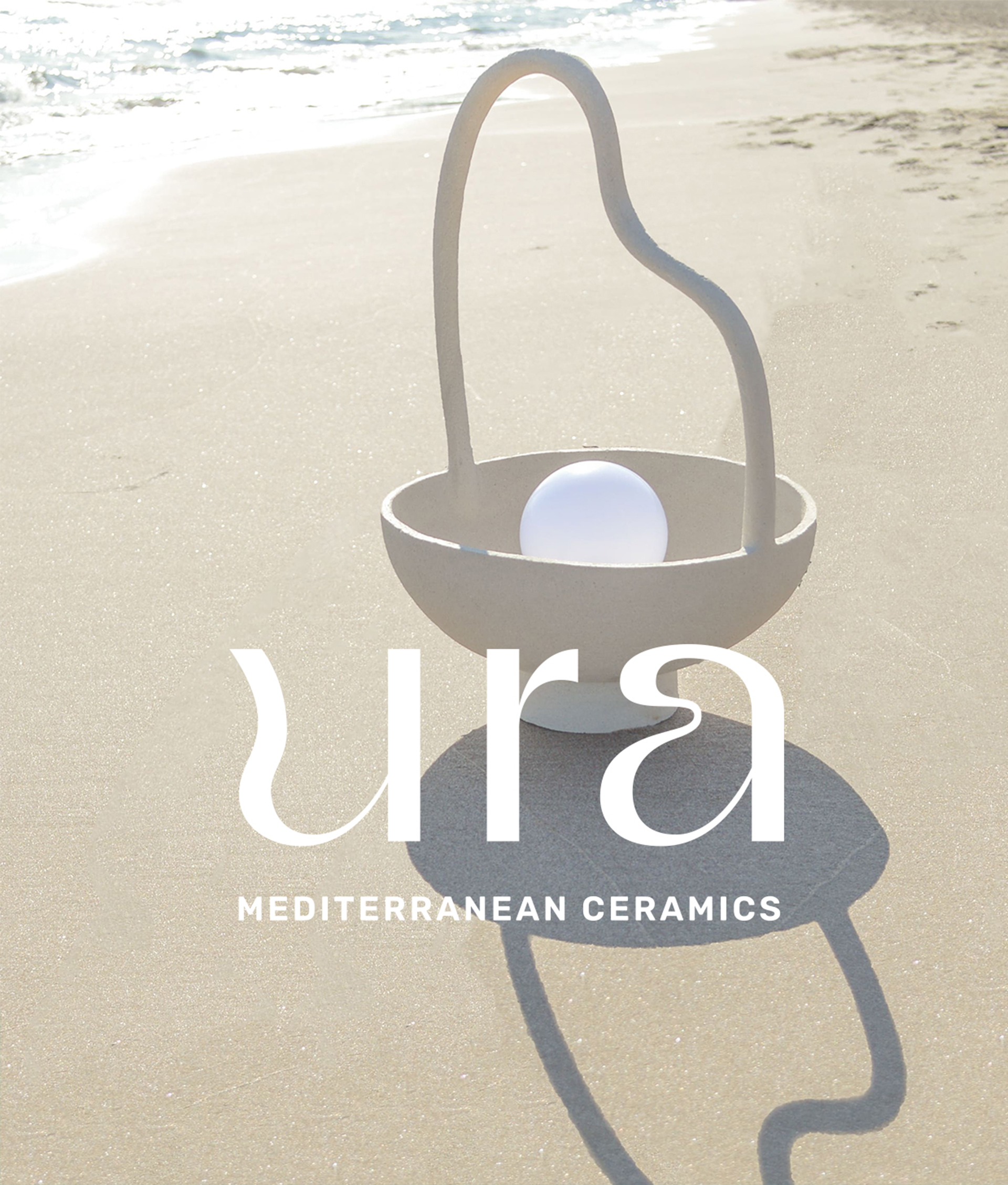
Ura means "water" in Basque—a culture that holds personal significance for her. The logo conveys the twists and fluidity of the ceramics she shapes with such care, as well as the elegance and simplicity of her pieces. Ura is light, it is Mediterranean, and it is craftsmanship.


